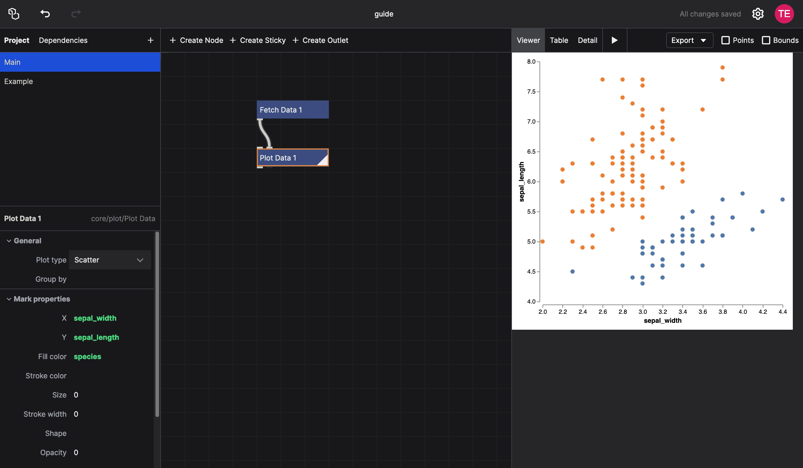
Creating a basic scatter plot only requires a handful of nodes. In this guide, we'll walk you through the process of creating a simple visualization from scratch.
Here's what we're going to make:
Fetching the Data
We'll start with a simple dataset containing 50 samples of Iris flowers. This dataset comes preloaded with NodeBox and is very easy to use:
- In the network view, click the "Create Node" button, or double-click in the empty space, to create a new node. Search for the
Fetch Datanode. - The
urlparameter of theFetch Datanode is already set tohttps://data.nodebox.live/iris.csv, which loads the Iris dataset.
The Fetch Data node is useful if you want to load data from a URL. If you have a file on your computer, you can use the Import Data node instead. It has a file parameter that allows you to select a file from your computer.
Plotting the Data
In the network view, create a new node and search for the Plot Data node. This node takes a table as input and plots it as a scatter plot.
To connect the Fetch Data node to the Plot Data node, drag from the out port of the Fetch Data node to the data port of the Plot Data node. Be careful: this node has two input ports. The first node is for a spec, the description of the plot. The second port is for the actual data. Since Fetch Data returns a table, you'll need to connect the output to the second port.
To see the results of the plot, double-click the Plot Data node to make it the rendered node. You should see an empty scatter plot. That's because we didn't tell the node which columns to use for the X and Y axes.
Configuring the Plot
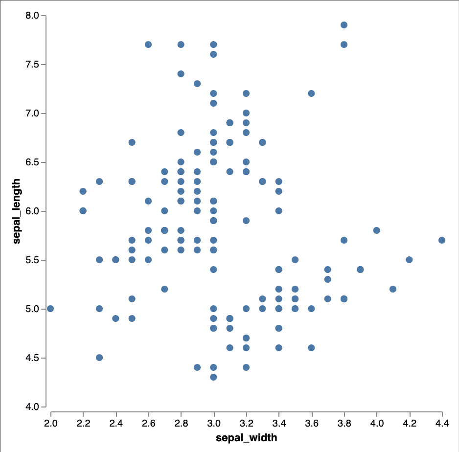
To configure the plot, we need to specify which columns to use for the X and Y axes. The Plot Data node has two parameters: x and y. To use data to drive these values, we're going to use expressions:
- Click the
{}icon next to thexparameter to switch it to an expression. It will turn slightly green, indicating that it's now an expression. - Click the empty expression field, then type
sepal_widthand press Enter. This tells the node to use thesepal_widthcolumn for the X axis. - Repeat the process for the
yparameter, using thesepal_lengthcolumn.
You will now get a basic scatter plot:
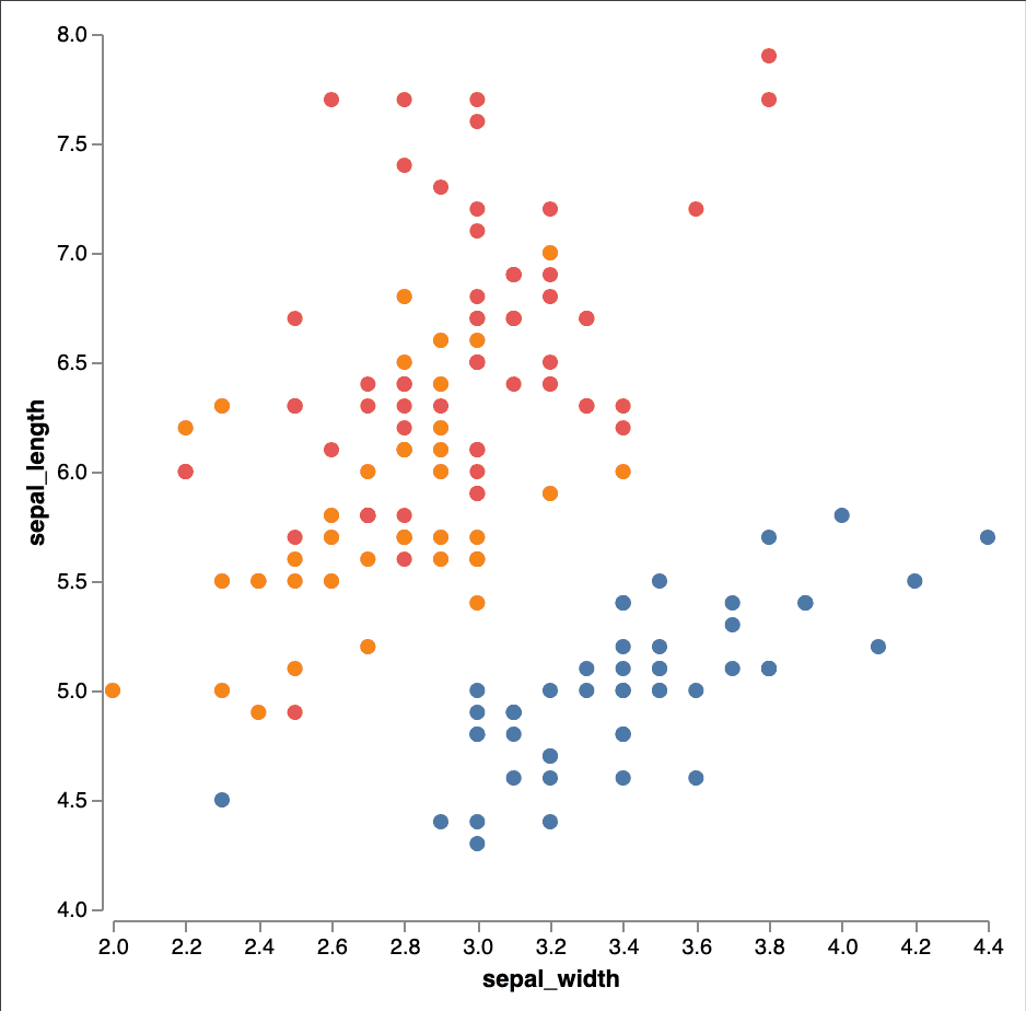
We can visualize the different species by using an expression for the Fill color parameter.
- Click the
{}icon next to theFill colorparameter. - In the expression field, type
speciesand press Enter.
We can now see that the different species are colored differently. We'll also notice that there is a correlation between the sepal width and sepal length of the Iris flowers, as well as the different species:
Note that we can also give fixed values to other parameters that we want to customize. For example, we can set the Size parameter to 10 to make the points smaller. We can also set the Stroke color to lightgray to give each point a slight outline.
Next Steps
This is just the beginning! You can further customize your scatter plot by adding labels, changing the axis labels, or even adding a trend line. Read customizing visualizations to learn more about the different ways you can enhance your visualizations.