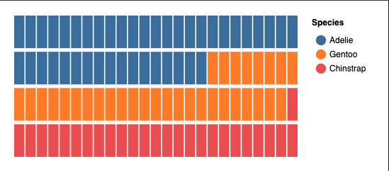
This guide walks you through creating a waffle chart to visualize penguin data filtered by year and sex.
Here's what we're going to make:
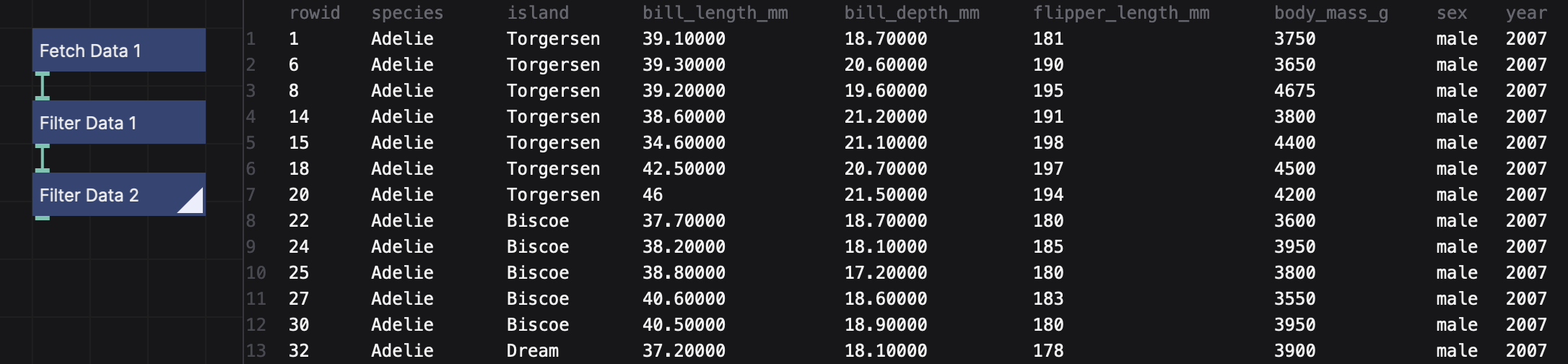
Fetching the Data
We'll use a dataset of penguin measurements, hosted online.
- In the network view, click the "Create Node" button or double-click in the empty space to create a new node. Search for the
Fetch Datanode. - Configure the
Fetch Datanode:- Set the
urlparameter tohttps://data.nodebox.live/penguins.csv.
- Set the
Filtering the Data
To focus on specific subsets of the penguin dataset, we'll apply filters for year and sex.
Filter by Year:
- Add a
Filter Datanode. - Click the
⋮next toLeft Valueand clickToggle Expression. Then typeyear(it should be green, indicating an expression). - Set the
Right Valueto a year value from the data set (e.g.2007).
- Add a
Filter by Sex:
- Add another
Filter Datanode. - Set the
Left Valueto the expressionsex(again, it should be green). - Set the
Right Valuetomale.
- Add another
Connect the nodes:
- Link the
Fetch Datanode to the firstFilter Datanode. - Connect the first
Filter Datanode to the secondFilter Datanode.
- Link the
Check the results:
- Double-click the second
Filter Datanode to see the filtered data in the Viewer. - If the data looks correct (only male penguins from 2007), proceed to the next step.
- Double-click the second
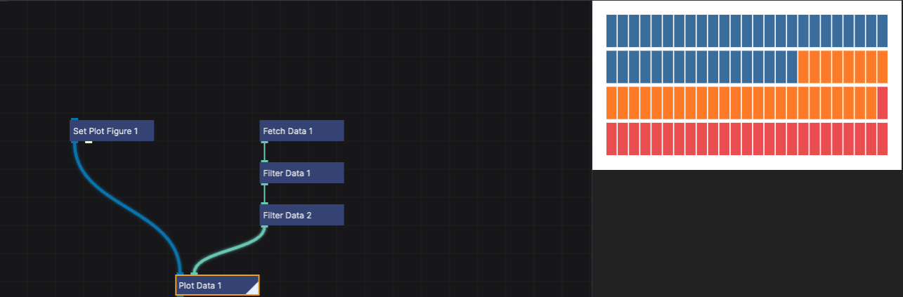
Setting Up the Waffle Chart
Now we’ll configure the waffle chart to visualize the filtered data.
Define the Chart Dimensions:
- Add a
Set Plot Figurenode. - Configure the
width,height, andpaddingvalues to define the chart layout:width: 400height: 200padding: 20
- Add a
Configure the Waffle Chart:
- Add a
Plot Datanode. - Set the following parameters:
Plot Type: WaffleGroup By: Toggle Expression, then typespeciesto group the data by species.Fill Color: Toggle expression, then typespeciescolumn to color the different species.X: Define the number of columns for the waffle chart, type:1,25Y: Define the number of rows for the waffle chart, type:1,4
- Add a
Connect the nodes:
- Link the
Set Plot Figurenode to thePlot Datanode. - Connect the second
Filter Datanode to thePlot Datanode. - Double-click the
Plot Datanode to render the waffle chart.
- Link the
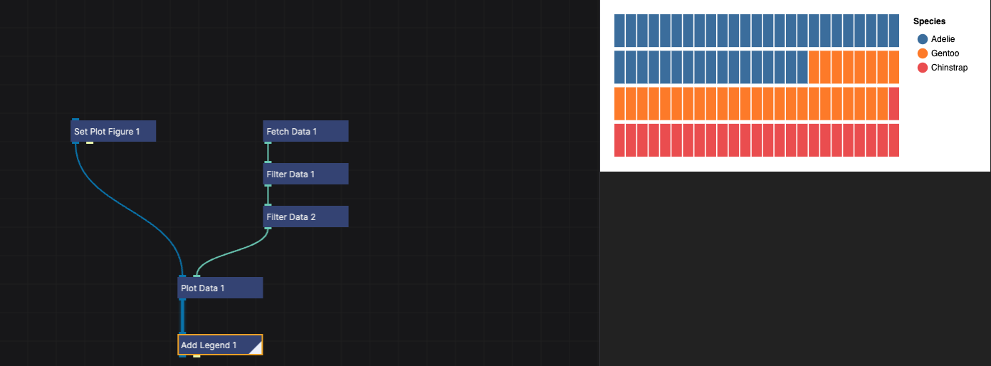
Adding a Legend
To make the chart more interpretable, we'll add a legend.
Add an
Add Legendnode.Link the
Plot Datanode to theAdd Legendnode and double-click theAdd Legendnode to make it rendered.Configure the following parameters:
Title: Add a descriptive title, such as "Species".Type: SymbolSymbol shape: Circle- Under Layout:
Orientation: Right
Publishing the Chart
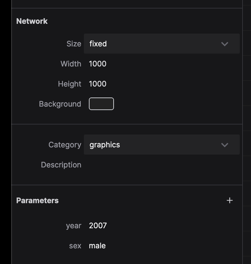
In order to make the parameters for the year and sex available to the user, we need to publish them.
- Select the
Filter Datanode that filters by year. - In the properties panel, click the
⋮button next to theRight Valueparameter, then clickPublish Parameter. - NodeBox will ask for the name of the parameter. Instead of
rightValue, writeyearand clickCreate Parameter.
Do the same for the Filter Data node that filters by sex:
- Select the
Filter Datanode that filters by sex. - In the properties panel, click the
⋮button next to theRight Valueparameter, then clickPublish Parameter. - NodeBox will ask for the name of the parameter. Instead of
rightValue, writesexand clickCreate Parameter.
These parameters will enable filtering based on user input. Click somewhere in the network view to deselect all the nodes. You can see that the network now has two new parameters: year and sex, with the values you set earlier.
Next Steps
You’ve created a dynamic waffle chart for visualizing penguin data! Here are a few ways to customize or extend your project:
- Use the network parameters to explore different years and sexes dynamically.
- Adjust the legend and chart dimensions for better clarity and presentation.
- Experiment with other plot types or grouping attributes to uncover new insights.